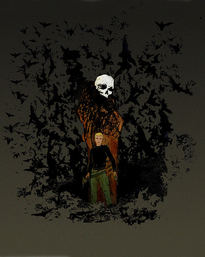
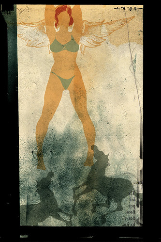
I have been thinking about doing a Jonny Quest image for the past week, this is what I ended up with. Originally, it was a thin banner, but I thought it needed more of environment so it got bigger. The banner was about the size of the figures, the top was about an inch above the skull, the bottom about an inch below the feet.
I went into this with the idea I might do a t-shirt, but I think this is not going to be the final draft, I think it needs some more work and maybe more of an action shot of 'Jonny."
Monday, April 26, 2010
jq
Monday, April 19, 2010
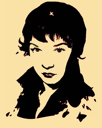
Wonder Woman #196 covered
 I've been checking out the blog Covered for some time now, and I thought I would try my hand at doing a cover. I looked for a issue that had elements that I liked, notably something that had a woman on the cover, so when I found Wonder Woman #196 from October 1971, I thought it would be perfect. I wasn't really thinking of the negative implications of the image, Diana in tattered cloths with a target on her back, decidedly the victim and far from the strong woman I associate with the character.
 The cover was during a time when Wonder Woman gave up her powers and lived as Diana Prince, a normal human with no super powers who ran a Mod-clothing boutique, fighting crime in her spare time. This version of Wonder Woman was a thinly veiled imitation of Mrs. Emma Peel from The Avengers. The cover is attributed to Mike Sekowsky and Dick Giordano.
 I redrew the cover using the original composition and removed things I thought were irrelevant, such as the extra story titles and the gun, I felt the shadow of the gunman was enough. Her body in the original seemed short to me, so I drew her a bit taller, I changed the expression on her face from what looks like fear to something a bit more angry. I also removed her boots and belt, they just didn't work for me.
I drew the title by hand as I couldn’t find a font that matched, and I thought it looked kind of interesting on its own, very late sixties early seventies. Most of the stuff I did was to streamline the cover, make it less busy. I gave it more of a pulp novel feel that I thought it needed. Though I liked the rendition, I thought I could do a bit better.
 I drew a second version with a slightly different composition and further removed information, just the figure and implied shadow of the gunman. I feel this is a better representation of my style than that of my first try. I stylized the cover a bit more with a shortened price and issue number box, a new font for the title and a modified barcode. If you scan the barcode, it would have all the publishing information. I felt the painted target on her back wasn’t enough, so multiple targets replaced it. The dirty framed edges are something I’ve been using in my other art for sometime now, it works for this.
Though my version of Wonder Woman is not as easily recognizable as popular renditions of her with the red white and blue outfit, it does fit with the feel of this particular era of the book. By issue #203, the “Women’s Lib Issue”, it was the end of the Diana Prince era and in issue #204, Wonder Woman went back to the traditional look that carries on till today.
Sunday, April 18, 2010

Monday, April 12, 2010
Sunday, April 11, 2010
Saturday, April 10, 2010


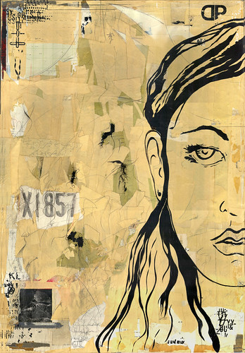
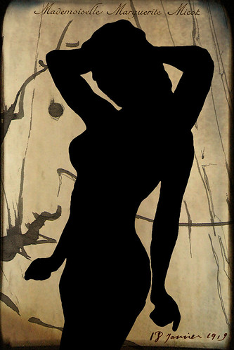
Mademoiselle Marguerite Micot
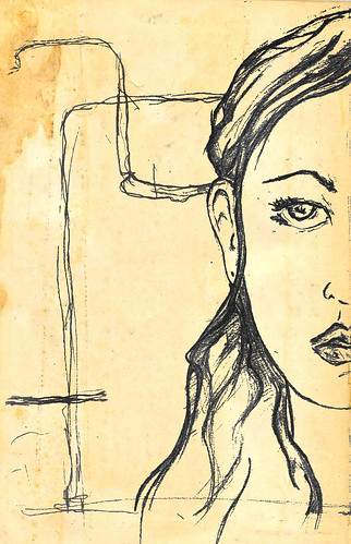
An image I've been messing around with for awhile, still think it needs work. The title and text comes from an old business card from 1918.
Subscribe to:
Comments (Atom)